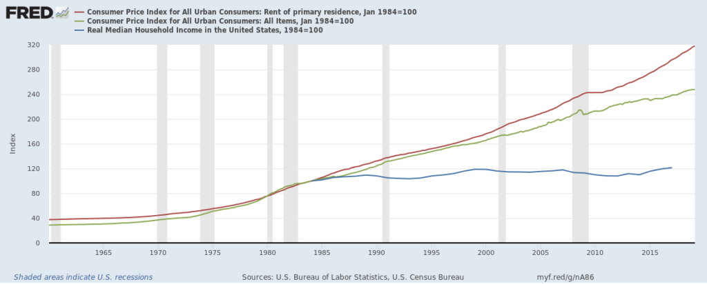
There’s already too much in the post below, but I think this is the most revealing graph of all:
I produced it with data going back to 1960, though the real median household income series only starts in 1984. Still, it shows the dramatic increase in rent compared to the almost-nonexistent increase in real median income comparatively.
