How not to be fooled by viral charts.
While I like Noah Smith often, he likes to tell spectacularly unconvincing lies about how rent has not gone up much. As anyone alive knows, especially since 2000 or so, rent has shot up enormously. He uses some chart indexed to 1985 to make it look better than it is. However, if you index to 2000 it looks much different and worse:
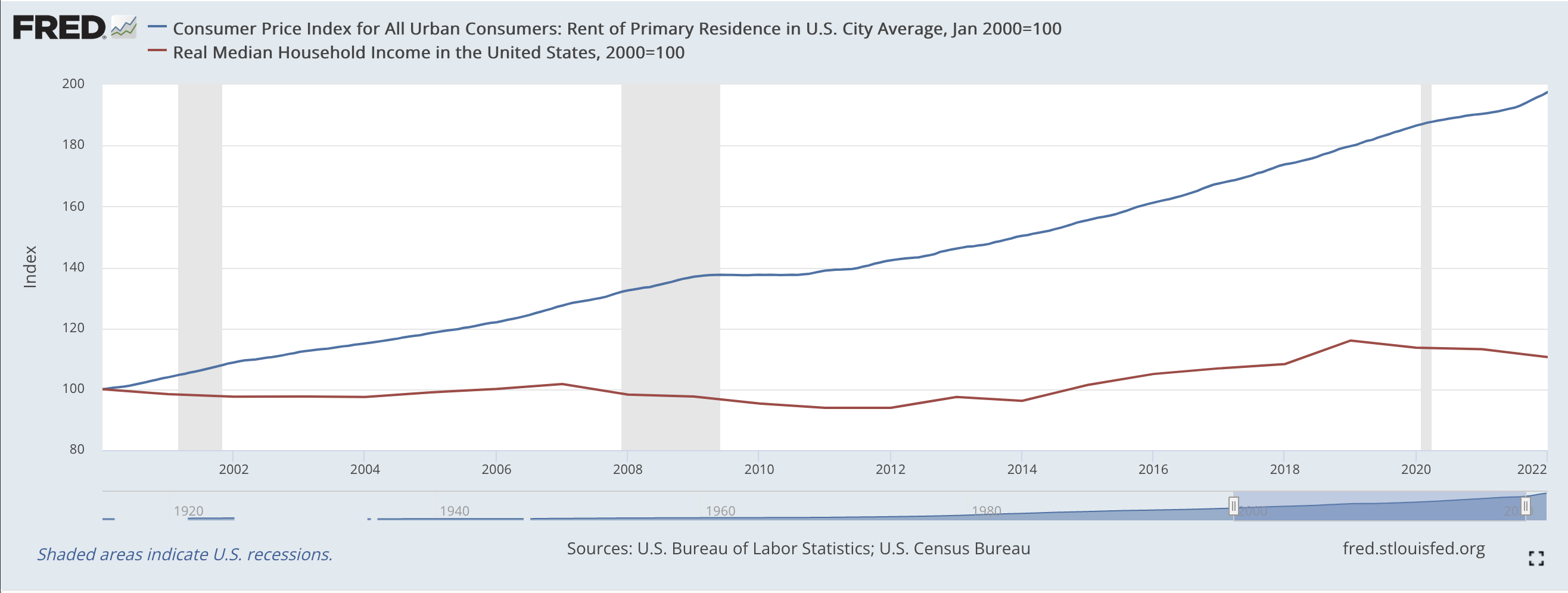
Funny there’s a chart that’s essentially a half-truth in a column about misleading charts. In the chart above, it’s pretty clear that rent has increased far faster than household income since 2000 (which is the correct measure here, not median personal income, as household income includes every member of a family who lives under the same roof, including spouses and their dependents).
Now I’m wicked bad at math, but rental costs are 79% higher vs. household income than they were in 2000. And that’s a pretty large fucking difference. The divergence would be even greater if you ran the numbers for desirable cities where the good jobs are and not just for every city (which is what the above chart shows). I’ve not done it, but I’m guessing it’d be in the range of 100%-300% higher depending on desirable city since 2000.
Also, the data above only goes to the beginning of 2022 for rent CPI. If it extended into 2023 it’d look far worse as rent has shot up enormously in the last year nearly everywhere. (Anecdotally, we moved and now we’re paying 44% more in rent than we were last year for a worse house with a much smaller yard in a fairly-comparable urban area. This is now the norm.)
It seems part of the professional code of every economist is to lie about rent and inflation. I have no idea why but it is oddly pervasive — even when the data is just right there. No economist can be trusted here and Noah is one of the very worst.