Contra Drum

What puzzles me about Drum is that it’s so easy to find and use the relevant data. He must think his readers are pure idiots. And I guess he’s right. For instance, this article uses relevant data.

They find that “inflation-adjusted rents have increased by ~64% since 1960.” This is less than I’d found, but then again it matters how you examine the data (and where you look). And:

Next, we looked at cost-burden rates by household income quintile. Renters with incomes in the lowest 20% have had cost-burden rates greater than 70% since the 1970s, and affordability has continued to decline in recent years. Among renters in the lower middle bracket (making up to $41,186 a year), however, the increase in cost-burden rates has been significant, with an increase of 22% since the year 2000. Renters in other income brackets have fared better, but cost-burden rates have risen across the board.

Drum is not an expert on anything (and it shows), but people treat him like one. And he’s smart enough to dupe his readers with pretty graphs that look correct but contain misapplied or misunderstood data. That’s what makes him so rhetorically dangerous.

This article is also decent.

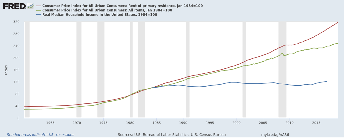
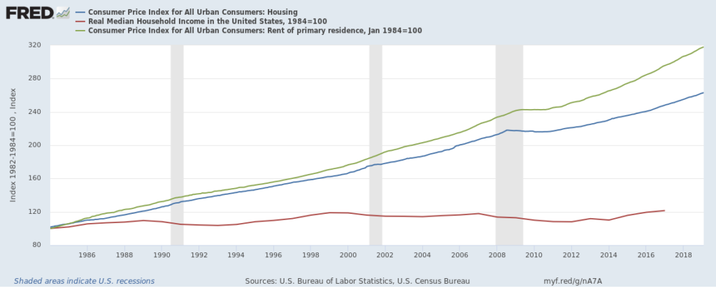
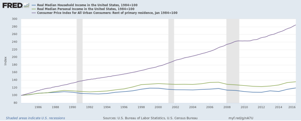
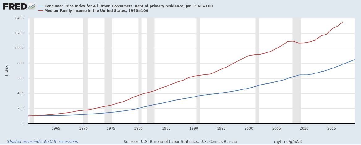
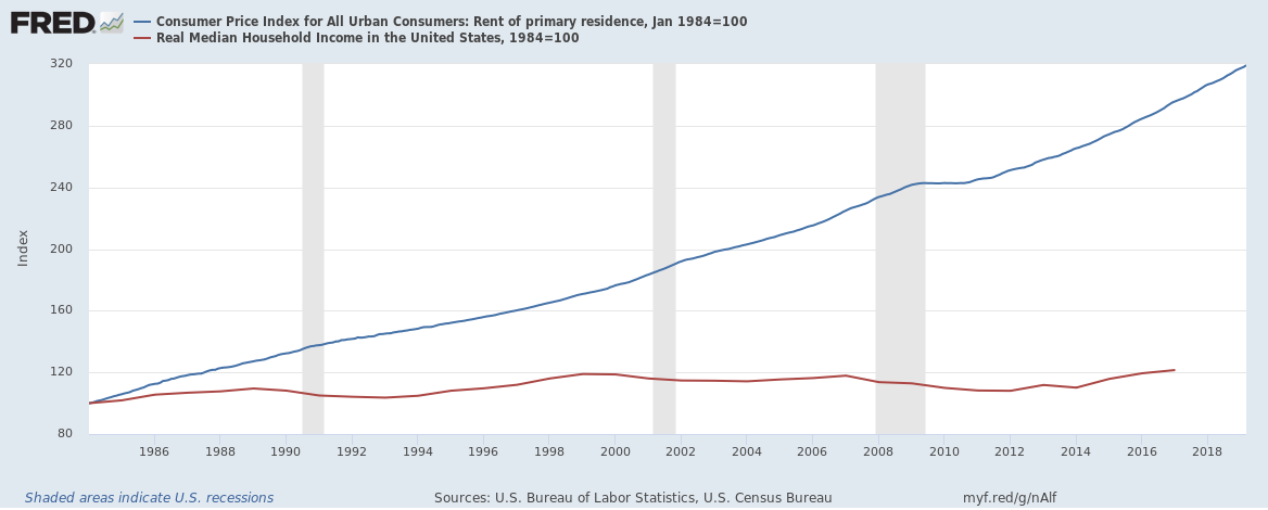
After I attempted to reproduce Drum’s data and could not, I finally figured out one of the tricks Drum pulled on his first graph, the one that compares rent of primary residence to median income. He’s using median family income and not median household income. Median family income only includes people who are related to one another and does not include anyone living alone (about 25% of the population). The difference, obviously, is significant. Because it changes the composition so much it means that median family income is about 30% higher than median household income, which is mostly enough to erase the very obvious and occurring-in-the-real-world divergence of rent from median income.

Needless to say, median household income is more relevant and more broad than Drum’s bullshit use of median family income (a trick he has pulled before). Using median family income is severely misleading for a whole host of reasons.

Here’s the two compared. First, Drum’s BS data, using family income:

Fredgraph

And here’s household income, the better measure (unfortunately this latter series only starts in 1984):

Fredgraph 1

Turns out you can get a lot of mileage out of mis-examining data. Drum does it frequently, and it does take some digging to figure out how he does it, exactly.

Most Revealing

There’s already too much in the post below, but I think this is the most revealing graph of all:

I produced it with data going back to 1960, though the real median household income series only starts in 1984. Still, it shows the dramatic increase in rent compared to the almost-nonexistent increase in real median income comparatively.

Date Used Incorrectly

This is why I despise anything Kevin Drum does relating to the economy. It’s always so shoddy and disingenuous. Could this be any more misleading?

This is a terrible way of looking at the data because, first, using the median tells nothing really about the range, which has widened greatly over the last 40 years. Second, the CPI and housing-specific CPI doesn’t in any way measure the composition of those in the bucket. How many people leave an urban area because the rent is too high, or are forced to commute for hours, etc.? It is a lot. There are other problems, too — in fact, too many to list so I will call a halt there and get to the data.

Here’s what it looks like when you examine the data in any sane way.

First, for some baseline. The top 20 MSAs in the US have approximately 122 million people dwelling in them. In nearly all of them (save Detroit), rent has increased much more quickly than the median income. Those 20 are 40% of the US population alone, so yes they are very important.

For instance, the Seattle-Tacoma-Bellevue MSA:

Fredgraph seattle

Notice how the red line, the CPI for rent, goes up far faster than the green line, the per capita personal income? And this doesn’t count, again, all the people who’ve left the area because rent became too expensive (which would be many, many).

And here’s similar for the NYC MSA:

Fredgraph NYC area

It’s not as bad, but it’d look a lot worse I bet if compositional effects could be taken into account.

And here’s a comparison of CPI for rent of primary residence versus the median weekly real earnings of all workers, age 16 and over, all indexed to 100 in 1982 so it’s easier to compare.

Fredgraph

Well, that looks a little worrying, does it not? In other words, if having it written out is easier than graphs, real earnings broadly have gone almost nowhere — up maybe 15% — and rents have gone up 240% since 1982. I think I see a problem.

Updated to add this graph, because per capita income can be misleading in its own way, but too lazy to change the colors to match (tired of doing someone else’s homework):

Updated to add another graph to show how much rent has increased even if you use median income measures, really shows how much rent shot up, using data Drum was allegedly using (though I can’t seem to repro his rosy results, though I didn’t try that hard):

Anything of Drum’s that you see relating to the economy, examine closely and it’s just safer to reflexively disbelieve. His agenda is to pretend that everything is tickety-boo and thus no changes at all need to be made — it’s the ever-maddening cry of the centrist in graphs and misleading data: “Nothing is possible!”