This is why I despise anything Kevin Drum does relating to the economy. It’s always so shoddy and disingenuous. Could this be any more misleading?
This is a terrible way of looking at the data because, first, using the median tells nothing really about the range, which has widened greatly over the last 40 years. Second, the CPI and housing-specific CPI doesn’t in any way measure the composition of those in the bucket. How many people leave an urban area because the rent is too high, or are forced to commute for hours, etc.? It is a lot. There are other problems, too — in fact, too many to list so I will call a halt there and get to the data.
Here’s what it looks like when you examine the data in any sane way.
First, for some baseline. The top 20 MSAs in the US have approximately 122 million people dwelling in them. In nearly all of them (save Detroit), rent has increased much more quickly than the median income. Those 20 are 40% of the US population alone, so yes they are very important.
For instance, the Seattle-Tacoma-Bellevue MSA:

Notice how the red line, the CPI for rent, goes up far faster than the green line, the per capita personal income? And this doesn’t count, again, all the people who’ve left the area because rent became too expensive (which would be many, many).
And here’s similar for the NYC MSA:

It’s not as bad, but it’d look a lot worse I bet if compositional effects could be taken into account.
And here’s a comparison of CPI for rent of primary residence versus the median weekly real earnings of all workers, age 16 and over, all indexed to 100 in 1982 so it’s easier to compare.

Well, that looks a little worrying, does it not? In other words, if having it written out is easier than graphs, real earnings broadly have gone almost nowhere — up maybe 15% — and rents have gone up 240% since 1982. I think I see a problem.
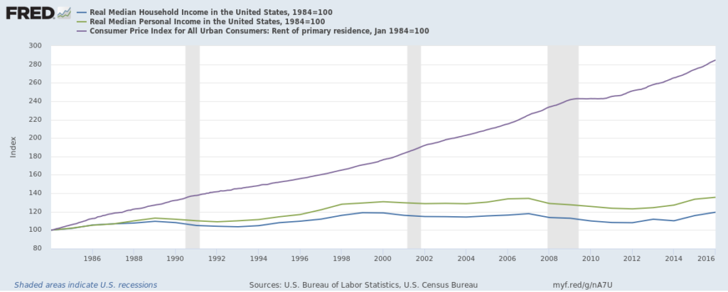
Updated to add this graph, because per capita income can be misleading in its own way, but too lazy to change the colors to match (tired of doing someone else’s homework):
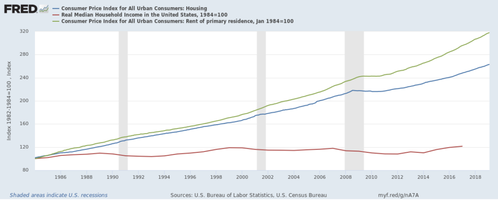
Updated to add another graph to show how much rent has increased even if you use median income measures, really shows how much rent shot up, using data Drum was allegedly using (though I can’t seem to repro his rosy results, though I didn’t try that hard):
Anything of Drum’s that you see relating to the economy, examine closely and it’s just safer to reflexively disbelieve. His agenda is to pretend that everything is tickety-boo and thus no changes at all need to be made — it’s the ever-maddening cry of the centrist in graphs and misleading data: “Nothing is possible!”