This is not at all a good comparison at all so you deserve the wrath. It is intellectually dishonest and it hides more than it reveals — though it employs all the usual nonsense of denying that anything is now worse than it was in the past. The same tired, wrong arguments get trotted out every time:
1) Houses are bigger now! Who gives a crap. I can’t buy a fraction of a house.
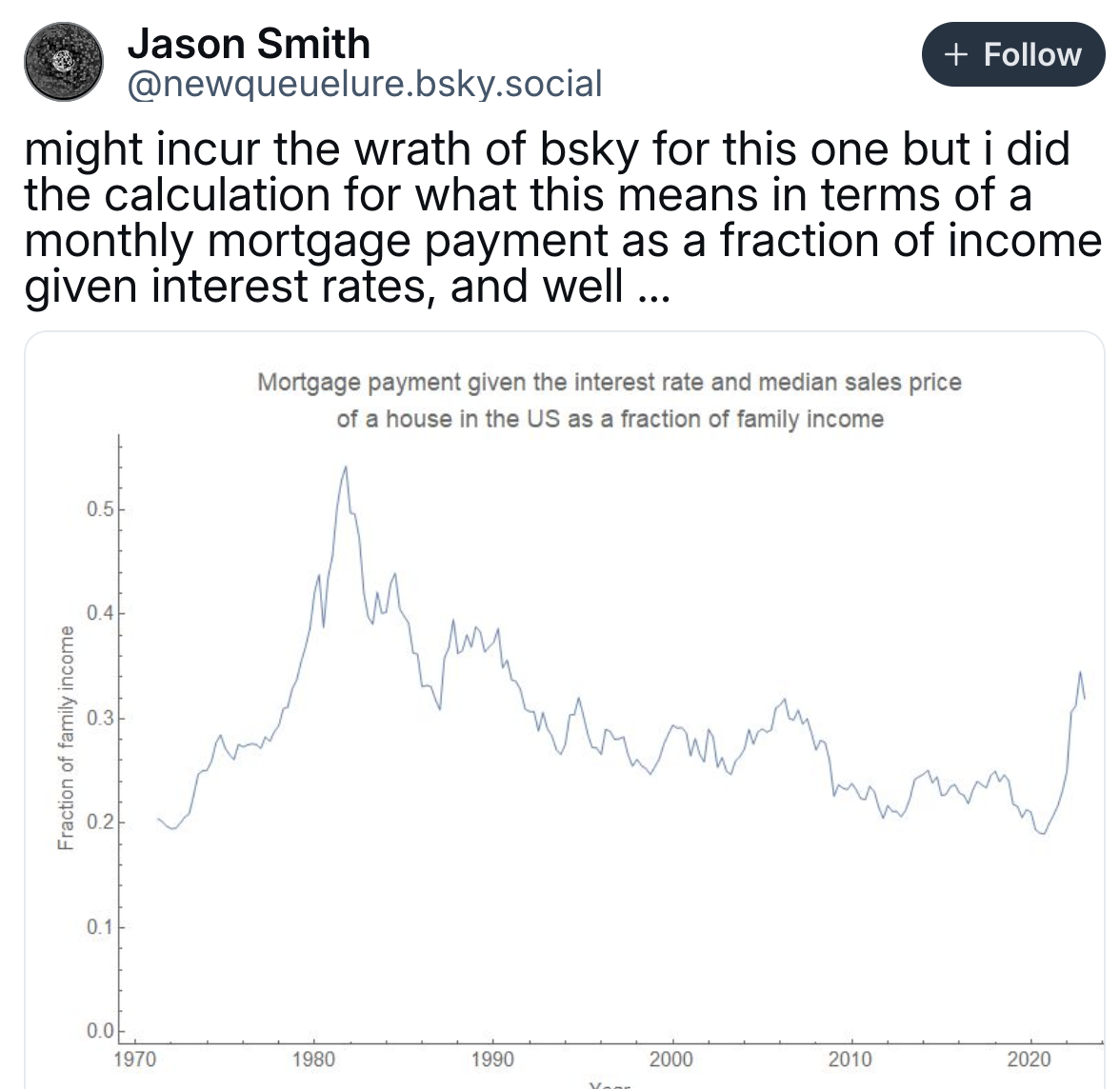
2) Interest rates are lower. This matters some, but the down payment is still huge and lower interest rates still might mean that you pay more over time because you have more principal to pay off. And obviously, it misrepresents affordability by changing the standard by which you measure it. It also ignores renters, which are ~30% of the population. Renters don’t really benefit from lower mortgage rates, and with house prices shooting up, more people become renters thus leading to higher rent. QED.
Another relevant factor that these “everything is so super-duper rosy” types ignore: Household size has changed dramatically since 1980. This matters a lot as there are far more single people now, households are a lot smaller, but house sizes are increasing. This means that smaller households have a more difficult time purchasing anything at all.
I knew people in the 1990s who bought large homes with one person working a blue-collar job in medium-size markets (so not rural) that now would have no hope of purchasing the smallest condo available (much less house) in those same markets working the same job.
I’m not sure what the major malfunction of the people who trot out graphs like that is. They can’t see the obvious, no matter how many people show it to them. They must not want to see.